4 TIME AWARD WINNER
Morgan Stanley Investment Management (MSIM)
Summer 2018
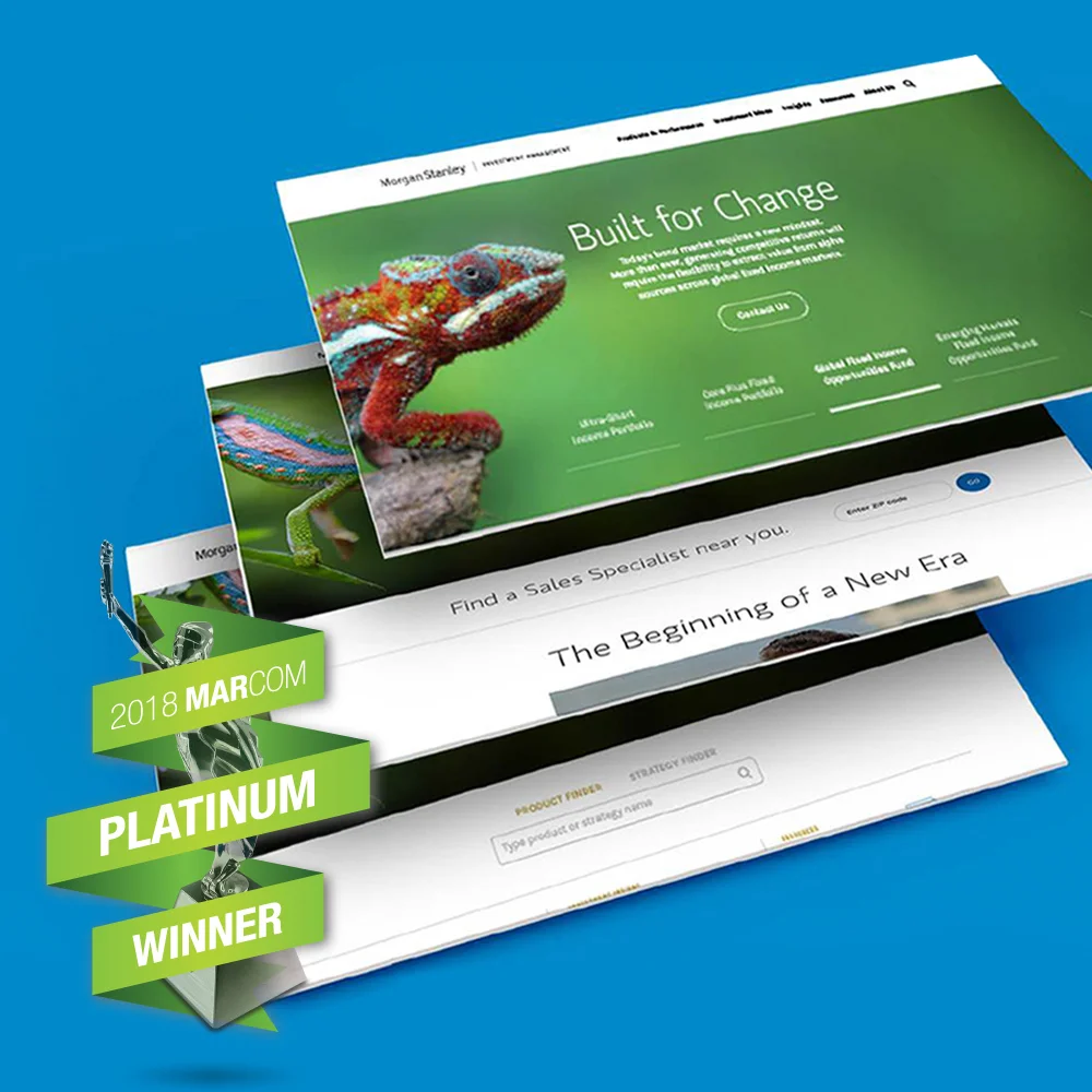
The objective of the campaign was to showcase how MSIM as a firm is able to adapt and outperform despite the current volatile state of the market. We incorporated various species of chameleons across the 150+ assets of the campaign to illustrate the theme of Built for Change. This was the largest campaign we have launched to date in terms of collateral and technological implementation. We deployed 36+ targeted user journeys to over 80k+ clients, and translated into 5 languages.
AWARDS
• Gramercy Institute Asset Management Marketing Awards, 2019
– Best in Show
– Best in Category
– Multi-Country Award
• Marcom Award, Platinum Award, 2018
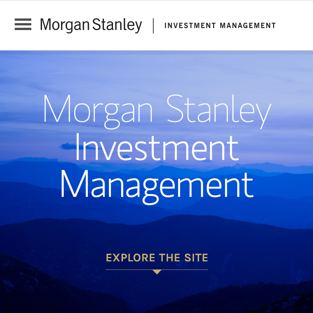
The Morgan Stanley team partnered with the members of HUGE to redesign MSIM.com. I art directed the project, designed additional templates, curated imagery and developed a chartography system for the Investment Management brand as a whole. After the handoff our team worked directly with IT to develop the functioning site that launched Q2 of 2016. As a result the site has had a 500% increase in traffic.
Whiteglove Occasions (WGO) is a full-service events planning company that provides custom design, catering, decor and photography for events ranging from corporate, weddings, and kids parties.
The inspiration for the name came from the book "White Gloves and Party Manners," which is a young ladies guide to how one should behave at any special occasion. This book was a childhood staple for the founders Alissa and Aneesa growing up, and they wanted their brand identity to be reminiscent of the book's classic feel but also have a contemporary, feminine feel to it as well.
We knew we wanted to include a graphic of white gloves because we felt it was a strong symbol for elegant parties and high-end service. The final identity we came up with features the classic white gloves with dainty details of stitching and bows, but the vibrant color palette, handwritten typography and custom photography make it feel current and fresh.
Lost + Found (L+F) is an app where one can go to search for their missed connections from their everyday lives. Unlike most dating apps which are primarily based on looks, L+F helps the user find the person who they've already had an encounter with but didn't have the opportunity to fully connect. Similar to a physical "lost and found," we wanted the branding to convey a friendly, inviting space for the user to openly explore. As such, we gave the brand somewhat of a retro feel to evoke a sense of nostalgia and comfortability. The combination of Futura, the bauhaus inspired typeface predominant in the 50s, paired with rich sepia tones convey a sense of familiarity. I made the logo feel more contemporary by incorporating a minimalist linear icon into the graphic. The "o" in found is replaced by a location marker with an arrow woven through to represent the place where the user was struck by cupid's arrow.
Download the app here
Consulting | Summer 2014
Lagos, Portgual is a vacation hotspot known for their beach culture, yet an online excursion booking service didn’t previously exist. While developing the identity, we knew we wanted to give it a young, surfer vibe, yet still also maintain an official tone. The final logo we created uses curvaceous lettering that flows into one another, which somewhat resembles the movement of a rolling wave. The typography and color palette are inspired by water themes playing off the name of the brand. The negative space of the icon creates a wave graphic, and If you look closely, you’ll notice is comprised of the letters “J” & “R”.
Consulting | Winter 2014
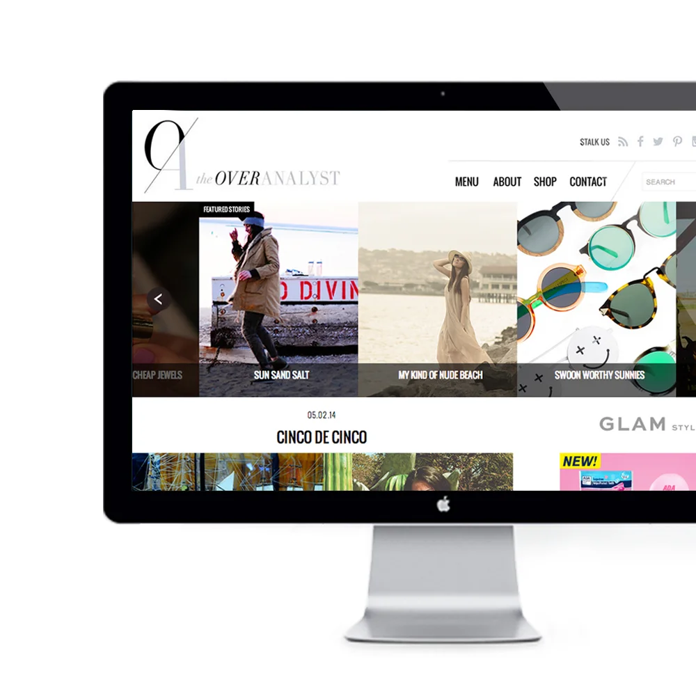
My now partner Jenna, approached me to collaborate with her on her fashion and lifestyle blog The Overanalyst (TOA). We wanted to give the logo and site a refresh while maintaining somewhat of a similar look as the original branding.
For the logo, I used a serifed font reminiscent of the original, but modernized it by using a thinner more delicate typeface. I also created the O/A brand mark that could stand independently of the logo. I used the diagonal line dividing the "O" and the "A" as as design element throughout the site and on social media platforms. We opted for a clean design and minimal color palette of black, white and cool greys to make the content and imagery the primary focus of the site.
Development: MFVS
Photography: Ana Maria Rico
Consulting | Fall 2013
The idea behind ROCK Pilates was to create a workout experience unlike the typical pilates studio. Their holistic approach to health combines both exercise and nutritional counsel in a edgy yet inviting environment for men and women alike.
The final logo visualizes what the ROCK brand is all about. The heavy typography of the "ROCK" conveys power and strength, and pairs nicely with the delicate lettering of the pilates; while the deep grey and fire engine red give it an athletic, gender neutral look. The overall minimalist approach gives it an honest and approachable feel that reflects the brands' "no frills" approach to fitness.
Nah Nah Bah Cafe & Lounge
Consulting, Spring 2016, 2014
Rising Cock 10 Year Anniversary Blowout
Consulting, Spring 2014
Bank of America Merrill Lynch
Winter 2013
A triplex (high gloss, blue and silver metallic foil) invitation for Bank of America Merrill Lynch’s Global Advisory board exclusive event held for fifty of their top-tier clients from around the world.
On the interior of the invitation the words “Join Us” become the silhouette of the Manhattan skyline which is revealed as the image fades in from left to right. We only see the full color image once we reach the right most building, The Bank of America Tower at One Bryant Park, giving it prominence amongst the cityscape. On the left panel I’ve created a pocket to carry the event agenda. The “Join Us” becomes a branded element connecting each of the pieces. For the final touch each envelope is addressed in hand-calligraphy.
Consulting | Winter 2013
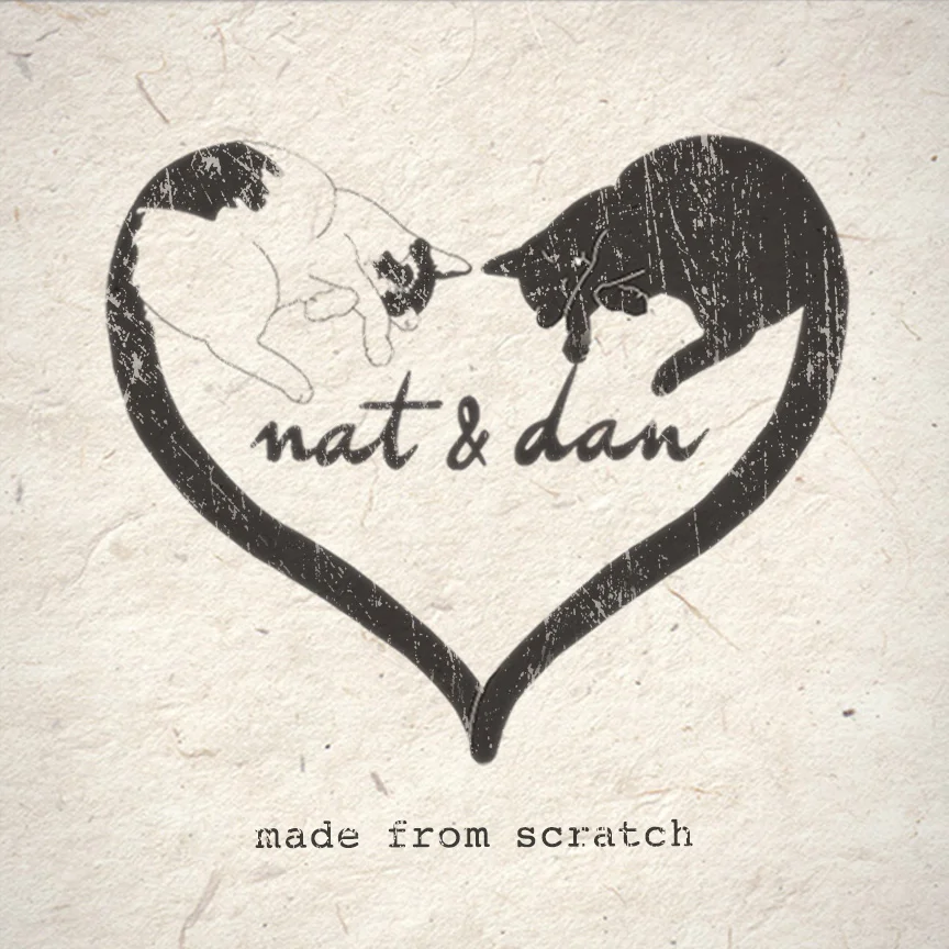
Nat & Dan are two Brooklyn based chicks who were looking to open an etsy shop of their homemade artisanal products – from knit goods to soy candles. They wanted their identity to communicate the TLC that went into every piece, and wanted to include their two loves, their cats Snugga & Dooba. From there I created a the logo of the two taking a cat nap with their intertwined tails forming a heart shape around the text which I’ve rendered in a handwritten script. To finish the organic look we turned this graphic into a rubber stamp which they’d use on all their packaging, business cards and promo items. From product to packaging everything really is “made from scratch”.
Bank of America Merrill Lynch
Summer 2013
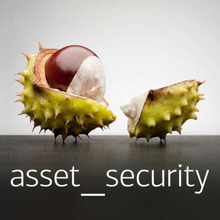
International print ad for Bank of America Merrill Lynch’s Global Custody and Agency Services (GCAS) – a service which provides a number of solutions for safeguarding their clients’ funds.
The line of business selected the rock climber concept. The tight crop focuses your attention on the carabiner – the only thing keeping the climber safe in this risky environment, which represents the security GCAS provides your institutions’ assets.
Alternate A: The metaphor of the renaissance helmet has dual significance, both the armor which is protecting the guard, as well as the guards' duty to protect the castle.
Alternate B: The horse chestnut is an unexpected example of a defense mechanism in nature. The spiked shell protects the nut within.
Euromoney, Institutional Investor
Fall 2013
Media Kit design for Institutional Investor Journals, featuring: Cover, Table of Contents, Interior Spread with Details of the Geographic and Subscriber Breakdown Graphics, Ad Specs, Editorial Calendar and Print and Web Rate Cards.
Consulting | Spring 2010 – Winter 2015
I’ve been working with the boys at Nimble Fitness for a few years now. They hadn’t established a clear visual identity when they first launched their business, but as we've worked together we've developed a cohesive and recognizable brand. On each piece I’ve incorporated the green swoosh either as an icon or a pattern to evoke the feeling of nimble, organic movement.
Projects include: storefront design, outdoor advertising, brochures, direct mail, and apparel.
Bank of America Merrill Lynch
Winter 2013
The Bank of America Merrill Lynch (BAML) tombstone brochure is a marketing piece used to showcase the volume of deals as well as the depth and breadth of their finance offerings completed annually. The generous use of white space paired with the silhouetted iconic imagery give it a clean, modern feel resemblant of a sterile hospital. Each spread features an image representative of the industry sector: a tight crop of a white coat pocket for Healthcare Services, an InVitro Fertilization device for Medical Technology and test tubes that resemble a rising bar graph for Life Sciences. Each image has been color corrected to compliment BAML’s new blue color palette.
Bank of America Merrill Lynch
Spring 2013
International print ad for CashPro Foreign Exchange Services to promote their newest functionality. This update allows the user to convert currency when making cross-border payments when they previously had to make conversions through a third-party.
We wanted to communicate our global reach as well as the simplicity of this new payment channel. The concept they selected was the contrasting soup spoons with the headline “yen_zen”. I’ve paired the ornately adorned spoon with yen, juxtaposed is the starkly white spoon above zen. These side-by-side spoons not only speak to the conversion from one currency to another, it also highlights the “zen” you’ll acquire from the simplicity of this service.
Consulting | Spring 2010
Support The Kid (STK) is a non-profit organization created in memory of Nicholas Wolber, whose mission is to raise money to distribute to underprivileged children battling cancer.
The playful typography and bright color palette conveys STK's identity – a welcoming community for the kids, by the kids.
Bank of America Merrill Lynch
Winter 2013
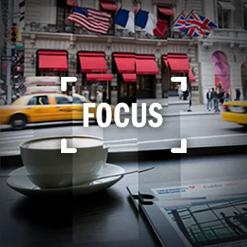
A direct mail teaser to promote the launch of Cash Management Essentials – a new bundle treasury management solution for small business owners to simplify transactions. We wanted to convey that this service would streamline everyday tasks therefore enabling the user to focus more on their business.
I came up with the concept of using the camera viewfinder as a metaphor for focus. The dicut sleeve and minimal black and silver metallic foil details delineate the body of a sleek digital camera. Printed on the acetate window is the word “focus”, through which you see a David Hockney inspired collage of a street view of manhattan. The layers and multiple exposures evoke feelings of chaos– alluding to the numerous obligations that come with being a small business owner.
By the power button you’re prompted to remove the insert which reveals the business offerings as well as a the secondary surprise pay-off of the headline in the viewfinder. The idea of simplicity and focus are heightened through the juxtaposition of the clean typography and minimal copy and the initial distracting visual.
The piece is delivered in an aluminized vacuum sealed bag to resemble the packaging of an electronic device.
Consulting | Winter 2012
La Veritá (LV) is a mentoring program designed to prepare teenagers to young adults for their future. When my client and I began concepting the LV identity we knew we wanted to create something somewhat serious to give it an authoritative feel but yet still maintain a young appeal. La Veritá is Italian for The Truth, from the tagline “Growth Starts With The Truth” we developed the idea of the deep rooted tree. I wanted more of the emphasis to be on the intricate roots than the top portion so I rendered them within a half circle in negative space to give the foundation more weight, representative of the human need to create a solid foundation to realize self-growth. The final logo embodies what this program represents – just as a tree began with a single seed, the path to deep rooted growth begins with the first step of seeking support to maximize one’s potential.
Bank of America Merrill Lynch
Winter 2013
This bold pair of cells as though being seen under a microscope is an unexpected visual metaphor for the connections Bank of America Merrill Lynch is able to provide to their clients in the Healthcare industry through our relationships and expertise.
On image three you’ll see two alternates that were also presented. The runner up was concept A – an evocative candid shot of two surgeons collaborating at work. In concept B I had our illustrator recreate what looks like a human spine from stack of pills, one of which has been replaced with an artificial disc which speaks to the unification of technology and science in the industry.
Consulting | Fall 2012
A blind embossed business card printed on a 110# ivory cover stock. We used Courier New for the contact information, the typeface used in screenplays, as a nod to the film industry.
Euromoney, Institutional Investor
Spring 2011
Institutional Investor (II) is a well known publisher in the finance community. They developed this specialized platform, iiSearches, to provide sales leads, news and mandate data to their clients – primarily Institutional plan sponsors, consultants and investment managers.
I knew wanted to incorporate the parent logo into iiSearches to give it credibility, but needed to counterbalance the classic Iogo with a sleek san-serif typeface to give it a modern techy feel. I kept the classic blue from the II logo for recognizability but made it a bit more current by adding pops of bright green. These accents bring attention to the arrow connecting the “H” and the “E” – representative of the platform pointing the user in the right direction.
Bank of America Merrill Lynch
Spring 2011
The objective was to design an invitation for an high profile gala pre-screening and food tasting which Bank of America would be sponsoring at the Toronto International Film Festival in Canada. Our high end invitation designs are typically on the conservative side, but the line of business requested we come up with something more creative since the event was associated with the arts.
The concept we ended up going with is a high end movie ticket. I like the idea of taking something common place and making it upscale by using high end production materials. The client chose an old school Hollywood glam theme, so I incorporated a soft gold metallic foil on McCoy silk cover stock to play up the chic effect. The die cut edge, perforation for a stub and the typefaces selected all add to the authenticity of the ticket. The perforated stub functions as the guests’ admission pass. Here I’ve included the event time, date and location so the information was readily accessible on the day of the event.
The envelope I selected is a silk black stock with a subtle pinstripe which was inspired by the classic red stripe popcorn buckets. “Admit One” is printed by the closure to subtly hints at what is enclosed.